I was asked a little while ago to design the logo for the NatCon in Brisbane.
I had never heard of NatCon. Why hadn’t I heard of this.
So I did a little digging around and found that the last event held in Brisbane was in 2006. That was 10 years ago. I was still in ad land back then and not totally focussing on books. Yeah, I’ve heard of ComicCon and Supanova, but NatCon had escaped my focus.
I met with Aimée Lindorff whom I recognised was one of the writers from a Tiny Owl Workshop project called Pillow Fight. She was also the chair for NatCon Brisbane.
They gave me the name of ‘Contact’ for the event. They also mentioned that would cover a lot of genres.
I walked away with many things in my head.
The brief was a simple, but I needed to think about all the genres they wanted to cover. They didn’t want too many pieces, just a logo and maybe some design elements for collateral.
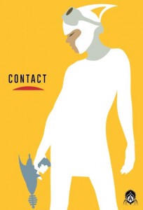
I took a 60s style of illustration and twisted it a little.
A little nod to the Super Science Fiction magazine covers via a femme fatale. I’ve always loved the way they had a strong women character suited up ready for action. Maybe a little too sexy at times, but she was always a strong character.
I saw her as the main focus to the design. She needed to look modern with the added highlights of nostalgia.
Aliens, got to have some sort of alien, right?
Thought a lot about this, I didn’t want to just create a Creature from the Black Lagoon style of alien. It needed to look different.
I took a more Starship Troopers angle to the aliens rather than a 60s film. Loath or love it, the alien designs were interesting.
I added a little pattern work which is a small nod to steampunk. Steampunk also weaves through the design of the raygun. I personally love Steampunk and Jules Verne with Journey to the Centre of the Earth being at the top of the list.
Overall it has all come together nicely.
Click on the images to view.
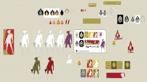
Snapshot of my work in progress.
I like to build in one document. This way I can move elements around simply and compare colours etc.
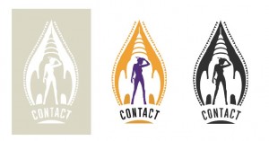
The final logo
3 versions. Reversed – Colour – Black and White
Design elements for icons, postcards etc.
Poster designs
Bright colours with a large character seem to work really well.
Extras
Gotta have tshirts.
More on Contact can be found HERE.
See you there in March.


